
Typography
Government websites need clear and consistent headings, highly legible body paragraphs, clear labels and easy-to-use input fields. Our default typefaces are designed for legibility and can adapt to a variety of visual tones.
Typography establishes a clear visual hierarchy and ensures content is readable, accessible, and consistent across InsureKidsNow.gov. Our typography follows the United States Web Design System (USWDS) standards with adaptations specific to IKN's brand and needs.
Typography principles:
- Use clear, legible fonts that work well at all screen sizes
- Maintain consistent spacing between text elements
- Ensure sufficient color contrast for accessibility
- Create visual hierarchy through font size, weight, and spacing
Font Families and Usage
Throughout InsureKidsNow.gov, we utilize two primary font families:
- Merriweather (a serif typeface)
- Source Sans Pro (a sans-serif typeface)
This aligns well with the roles defined in USWDS, which uses Merriweather as the default for font-heading and Source Sans Pro as the default for font-body.
| Role | Font Family | Typical Usage |
|---|---|---|
| Headings (H1, H2, H3, H4, H5) | Merriweather | Used for heading font |
| Body Copy & UI Text | Source Sans Pro | Used for body and UI fonts |
| H2/H3 Special Cases | Source Sans Pro (Semibold/Bold) | Allows for typographic distinction |
| H6 | Source Sans Pro (Bold, Uppercase) | Used for heading font |
The proper way to refer to Merriweather and Source Sans Pro on IKN via CSS:
"Merriweather Web", Georgia, Cambria, "Times New Roman", Times, serif
"Source Sans Pro Web", "Helvetica Neue", Helvetica, Roboto, Arial, sans-serif
Headings (H1-H6)
Headings organize content and help users scan pages quickly. Use heading levels in order (don't skip levels) to maintain proper document structure and accessibility. The focus for content implementers should be on semantic structure and consistent application of the defined visual sizes and weights.
Semantic Rules (Priority for Content Implementers)
- Hierarchy is mandatory: Headings must be nested logically. An H1 must only be followed by an H2, not an H3.
- One H1 per page: Every page on InsureKidsNow.gov must have one Heading 1 (H1).
- Do not use headings for styling: Semantic heading levels should be chosen first for document structure and accessibility, and then visual size applied. Do not change heading level (e.g., skipping H2 and going straight to H3) simply to achieve a different font size.
- Font Size Relation: Header elements should never have an equal or smaller font size than the standard paragraph element.
- Content Requirement: All headers need content (children).
Note on H2/H3 & H6 Variations:
Some H2, H3 and H6 examples are shown using Source Sans Pro (Semibold/Bold) with slight variations in size and line height. These represent different components (like navigation or specialized text blocks), they should be clearly defined and restricted to those components.
Examples of Headings
Examples of the different headings with correct font information: font-family, color, font-size and line-height.
H1 Heading or Page Title 40px
Merriweather, Bold, #0D76AD, 40px / 52px
H2 Sub-Heading Second Level Example 30px
Merriweather, Bold, #661466, 30px / 39px
H2 home screen class Read our Latest Newsletter! 26px
Source Sans Pro, Semi-Bold, #661466, 26px / 30px
H3 Example Header subhead 20px
Merriweather, Bold, #000000, 20px / 26px
H3 home screen class Engaging Local Municipalities in Medicaid
Source Sans Pro, Bold, #000000, 19px / 24px
H4 Example Header 17px
Merriweather, Bold, #1B1B1B, 17px / 25px
H5 This is a subhead H5 Example Header 15px
Merriweather, Bold, #1B1B1B, 15px / 20px
H6 THIS IS A SUBHEAD H6 EXAMPLE HEADER UPPERCASE 13PX
Source Sans Pro, Bold, #1B1B1B, 13px / 17px
Above: Examples of the various headings that are in use on InsureKidsNow.gov
Paragraph Text (Body Copy)
The primary font for body text is Source Sans Pro. Content implementers should focus on readability and accessibility guidelines.
Standard Body Text:
- Font: Source Sans Pro (regular weight is standard)
- Base Size: The CMS standard uses 16px
- Standard Line Height: The CMS standard uses 24px (1.5 line height). USWDS also suggests 1.5 or 1.62 (vads-font-line-height-5) for extended reading
Color: Default text color is typically #1B1B1B unless there’s a specific reason for a different color
Accessibility: If deviating from the default text color or background, ensure a minimum contrast ratio of 4.5:1 for normal text smaller than 18pt (24px)
Length/Measure: Paragraphs should not exceed 72ex (vads-size-line-length-5) in width to promote comfortable reading
Examples of Paragraph Text
Showing the standard body text format with correct font information: font-family, color, font-size and line-height.
On March 30, 2023, the Centers for Medicare & Medicaid Services (CMS), awarded $5.9 million in cooperative agreements to seven organizations in six states authorized under the Helping Ensure Access for Little Ones, Toddlers, and Hopeful Youth by Keeping Insurance Delivery Stable Act of 2017 (HEALTHY KIDS Act) with the purpose to increase the participation of eligible, uninsured AI/AN children in Medicaid and CHIP. These new Connecting Kids to Coverage HEALTHY KIDS AI/AN 2023 Outreach and Enrollment Cooperative Agreement awards will provide critical support for the effective and targeted strategies needed to enroll and retain eligible uninsured AI/AN children in Medicaid and CHIP.
The HEALTHY KIDS Act provides continued funding for activities and strategies aimed at educating AI/AN families about the availability of free or low-cost health coverage under Medicaid and CHIP, identifying AI/AN children likely to be eligible for these programs, and assisting families (including parents and pregnant individuals) to apply for and renew coverage.
Above: Example of two paragraphs of text
Links (Hyperlinks)
Hyperlinks are fundamental elements that guide users through content and navigation, connecting various internal pages and external resources. On InsureKidsNow.gov (IKN), links appear in the header, main menu navigation, left navigation, footers and throughout body copy [user query].
Good link typography supports a strong visual hierarchy and legibility, helping users find what they need. The styling for links must maintain consistency with the IKN brand color palette and ensure accessibility.
Standard Links: Links are typically distinguishable by color and text decoration (e.g., an underline). All standard links must adhere to the following color specifications, which are drawn from IKN's established brand colors:
| Link State | Color Name/Value | Purpose |
|---|---|---|
| Default | IKN Brand Color Blue: #0D76AD | The standard, clickable state color for most links. |
| Hover & Active | Medicaid Navy: #17415F | Indicates interactivity when a user mouses over or engages the link. |
| Visited | IKN Brand Color Plum: #661466 | Indicates a link that has been previously clicked by the user. |
Semantic Rules: The following should be a priority for Content Implementers.
- Accessibility and Contrast: Per USWDS and CMS standards, ensuring links are accessible to all users is critical. The Web Content Accessibility Guidelines (WCAG) recommend a minimum contrast ratio of 4.5:1 for normal text against its background. Links must meet this standard in all states.
- Focus State: Links must receive a clear visual focus outline when a user tabs to them using a keyboard. This focus outline ensures accessibility for keyboard users and those with visual impairments. The focus outline should be clearly visible and consistent with other interactive elements, such as the #2491FF focus outline used for buttons.
- Avoid Overlapping Functionality: Avoid turning headings into links in most contexts because combining dual functionality can confuse users, particularly those relying on screen readers for navigation. An exception can be made in components like cards where the card functions as a single actionable unit, and the linked heading is the primary call to action.
- Link Text: Link text should be descriptive and make sense out of context to help users understand the destination.
External Links: Links directed to external websites (outside of IKN.gov) require an explicit visual indicator for transparency and to set user expectations.
- Iconography: External links must include an icon, typically the “launch” icon supplied by USWDS, placed directly next to the link text. The CMS Design System also provides a specific mention of a "Third Party External Link" component.
- Icon Color: The icon adjacent to an external link must adopt the same color as the text next to it, ensuring consistency between the text and the visual cue across all link states (default, hover, active, and visited).
Examples of Links
Showing a variety of links that exist throughout InsureKidsNow.gov.
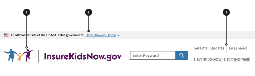
Above: IKN Header with multiple links
Connecting Kids to Coverage (CKC) outreach and enrollment grants support activities aimed at identifying and enrolling children who are eligible for Medicaid and the Children's Health Insurance Program (CHIP). Since 2009, CMS has awarded $336.9 million in CKC outreach and enrollment grants to 363 eligible entities, including community-based organizations, tribes, states, and local governments. Along with the Connecting Kids to Coverage National Campaign, these activities fund outreach and enrollment strategies aimed at educating families about the availability of Medicaid and CHIP and directly assisting families with the application and renewal process. The grants share the common goal to help reduce the number of children who are eligible for Medicaid and CHIP but are not enrolled.
Above: Standard text with internal links; the first link has already been visited, and the text is displayed in IKN plum (#661466); the second link has not been visited yet, and it is displayed in IKN blue (#0D76AD).
Usually, you have to renew coverage every year to keep them covered. Make sure your state has your current mailing address, phone number, email, or other contact information, especially if you have moved in the last year. This way, your state will be able to contact you about your Medicaid or CHIP coverage.
Above: Standard text with external link
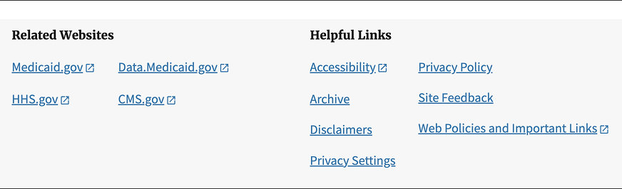
Above: IKN Gray Footer with multiple internal and external links

Above: IKN Blue Footer with internal and external links
Lists
Lists organize information into scannable, digestible chunks. InsureKidsNow.gov uses three types of lists: 1) bulleted lists (unordered), 2) numbered lists with standard numerals and 3) numbered lists with Roman numerals. Our list styling follows USWDS standards with IKN-specific guidance on when to use each type.
General list principles:
- Use lists to break up dense paragraphs and improve scannability
- Keep list items concise and parallel in structure
- Maintain consistent punctuation and capitalization within a list
- Limit nesting to 2-3 levels maximum for clarity
USWDS reference: See USWDS List component for detailed technical specifications and accessibility guidance.
Bulleted Lists (Unordered Lists)
Bulleted lists present items that have no specific order or hierarchy. Use bulleted lists when the sequence of items doesn't matter.
Specifications:
| Element | Font Size | Line Height | Spacing | Indentation | Bullet Style |
|---|---|---|---|---|---|
| First Level | 16px (1rem) | 1.6 | 8px between items | 24px left | disc |
| Second Level | 16px (1rem) | 1.6 | 8px between items | 48px left | circle |
| Third Level | 16px (1rem) | 1.6 | 8px between items | 72px left | square |
When to use bulleted lists:
- Features, benefits, or attributes that have no ranking
- Options or choices where order doesn't matter
- Groups of related items without sequence
- Summary points or key takeaways
IKN-specific guidance:
- Spacing above list: 16px from preceding paragraph
- Spacing below list: 24px before next element
- Text color: Same as body text (#1B1B1B)
- Maximum nesting: Avoid more than 2 levels when possible; 3 levels maximum
Examples of a Bulleted List
Showing a bulleted list with multiple levels of indentation:
- Routine check-ups
- Immunizations
- Doctor visits
- Lab Work
- Health examination
- Wellness program
- Exercise and fitness
- Nutrition guidance
- Mental health services
- Prescriptions
- Therapeutic services
- Inpatient and outpatient care
Above: Example of a bulleted list with multiple levels of indentation
Numbered Lists (Ordered Lists)
Numbered lists with standard numerals (1, 2, 3...) present items in a specific sequence or order. Use numbered lists when the order matters or when describing steps in a process.
Specifications:
| Element | Font Size | Line Height | Spacing | Indentation | Number Style |
|---|---|---|---|---|---|
| First Level | 16px (1rem) | 1.6 | 8px between items | 24px left | 1,2,3... |
| Second Level | 16px (1rem) | 1.6 | 8px between items | 48px left | 1,2,3... |
| Third Level | 16px (1rem) | 1.6 | 8px between items | 72px left | 1,2,3... |
When to use numbered lists:
- Step-by-step instructions or procedures
- Sequential processes that must be followed in order
- Ranked items (most important to least important)
- Items with a clear beginning and end
- Instructions for completing forms or applications
IKN-specific guidance:
- Spacing above list: 16px from preceding paragraph
- Spacing below list: 24px before next element
- Punctuation: Use periods after numbers (e.g., "1." not "1)")
- Sentence structure: Each item should be a complete sentence or parallel fragment
- Maximum nesting: Keep nesting to 2 levels when possible for clarity
Examples of a Numbered List
Showing a numbered list with multiple levels of indentation:
- Routine check-ups
- Immunizations
- Doctor visits
- Lab work
- Health examination
- Wellness programs
- Exercise and fintness
- Nutrition guidance
- Mental health services
- Prescriptions
- Therapeutic services
- Inpatient and outpatient care
Above: Example of a numbered list on IKN
Numbered Lists with Roman Numerals
Numbered lists with Roman numerals (I, II, III...) are used for formal documents, legal content, or when distinguishing major sections that contain sub-lists with standard numerals.
Specifications:
| Element | Font Size | Line Height | Spacing | Indentation | Number Style |
|---|---|---|---|---|---|
| First level (uppercase) | 16px (1rem) | 1.6 | 8px between items | 24px left | I,II,III... |
| Second level (standard) | 16px (1rem) | 1.6 | 8px between items | 48px left | I,II,III... |
| Third level (lowercase) | 16px (1rem) | 1.6 | 8px between items | 72px left | I,II,III... |
When to use Roman numeral lists:
- Formal policy documents or legal content
- Major sections or categories that contain numbered sub-lists
- Hierarchical content where Roman numerals denote top-level importance
- When distinguishing primary sections from detailed steps beneath them
- Official guidelines or regulations
IKN-specific guidance:
- Spacing above list: 16px from preceding paragraph
- Spacing below list: 24px before next element
- Use sparingly: Reserve for formal documents or when clear hierarchy is essential
- Capitalization: Use uppercase Roman numerals (I, II, III) for first level
- Format consistency: Keep formatting consistent with nested standard numerals below
Examples of a Numbered List with Roman Numerals
Showing a Roman numerals numbered list with multiple levels of indentation:
- Routine check-ups
- Immunizations
- Doctor visits
- Lab work
- Health examination
- Wellness programs
- Exercise and fintness
- Nutrition guidance
- Mental health services
- Prescriptions
- Therapeutic services
- Inpatient and outpatient care
Above: Example of a numbered list with Roman numerals
Side Navigation
The left sidebar navigation provides hierarchical, vertical navigation intended to display the "sub-navigation" within a specific section of the website. Its primary purpose is to help users see where they are within a site section and easily move between related pages. This guidance ensures content creators and developers maintain consistency, usability and accessibility.
Usage Guidelines
The side navigation component serves as secondary navigation for a group of closely related pages.
When to Use side navigation
- To display a navigational hierarchy typically limited to one to three levels.
- To create a sub-navigation for a distinct section of the website, such as under "Campaign Information" or "Find Coverage for Your Family".
- When a navigation structure is required for a group of related pages that are highly relevant to the content currently displayed.
When to Consider Alternatives
- If you have fewer than five pages in a section, a full navigational structure might not be necessary.
- If you need users to navigate to different areas on the same page, use the "On this page" component or internal anchor links instead.
- If the links are not closely related or do not live within the same section of the website.
Content and Structure Rules
The navigational hierarchy can be extensive on IKN, sometimes displaying lengthy lists with nested levels.
- Hierarchy Depth: Aim to keep the visible hierarchy manageable. Although three levels (Parent, Child, Grandchild) are supported by USWDS, content creators should strive to minimize depth and breadth to prevent users from missing items or requiring excessive clicks.
- Link Text: Link text must be concise and descriptive. The text should clearly convey the destination page's purpose. Link text may be a shorter derivative of the corresponding page title.
- Indicate Current Page: Always use the appropriate styling (often an "active" state or highlight border) to show the user precisely where they are within the navigational hierarchy.
- Nesting Behavior: IKN's left sidebar displays nested levels that are typically hidden until the corresponding top level is engaged (e.g., clicked or expanded). Content implementers must ensure this interaction is functional and intuitive.
- Link Appearance: In the current IKN design, links within the left navigation often utilize an off-blue color (#0D76AD) for emphasis. Body text within this component may use a black-ish color like #212121.
Placement and Layout:
On desktop views, the component should be positioned at the top of the left column in a two-column layout.
Mobile Behavior:
On mobile screens, the side navigation typically appears collapsed below the breadcrumb and above the page title. It is revealed when the user toggles a button, often labeled "Related pages menu," similar to an Accordion component. When expanded, this menu must push content downward rather than overlaying it.
Focus Order:
For keyboard users and screen readers, the side navigation should appear in the focus order immediately after the breadcrumb and before the main content. Users should also have the option to bypass this navigation entirely using the "Skip to main content" link.
Semantic Markup:
The component should be placed outside of the < main > element, ideally within an < aside > landmark region, to help screen readers define the structure of the page