
Back to Top
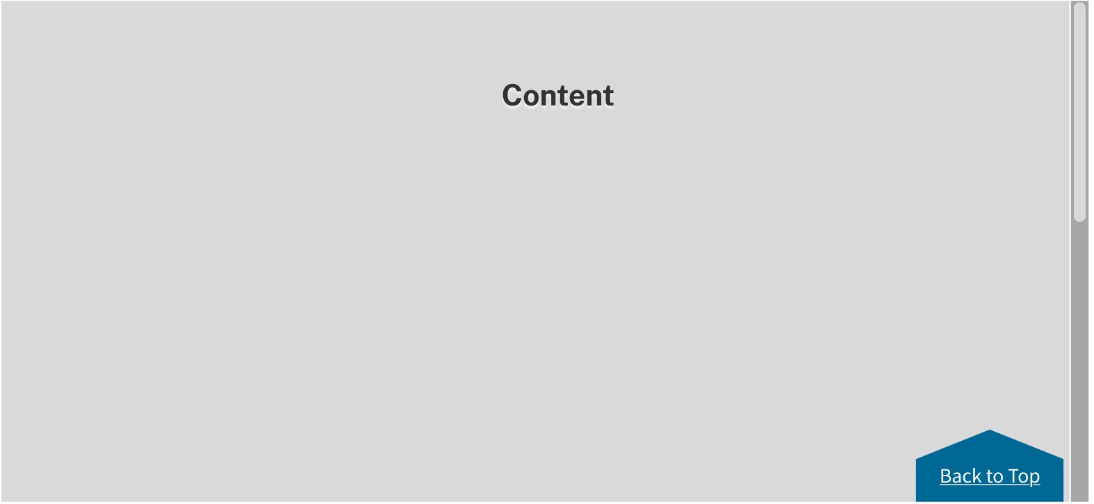
The Back to top component is a shortcut that allows the user to quickly navigate to the top of a long page of content.
When to use Back to Top:
In pages with static content that is more than two screens in length on large and medium screens, or more than four screens in length on small screens.
Usage:
- On large and medium screens.
- We only use one Back to top component per page.
When not to use Back to Top:
- In pages with static content that is short in length.
- On small screens, as in mobile devices, there will not be a Back to Top component.
IKN Back to Top
Placement:
- The Back to Top component is anchored to the lower right edge of its parent container (the main content area).
- In the desktop and tablet view there should be at least 5 spacing units (40 pixels) of white space above the Back to Top component and 2.5 spacing units (20 pixels) white space below.
Behavior:
- As the user scrolls down the page, the Back to Top component reveals as a sticky element in the lower right edge of the main content area.
- The Back to Top component stays fixed in the lower right edge of the main content area when the user reaches the bottom of the page.
- Clicking Back to Top takes the user to the top of the page.
Accessibility:
- Animations can be distracting to users with vestibular conditions.
- Some users may have smooth scrolling turned off in their preferences, which will affect the transition going back to the top of the page.
- After the user has clicked Back to Top, the code should call focus on an element near the top of the page, such as the H1.